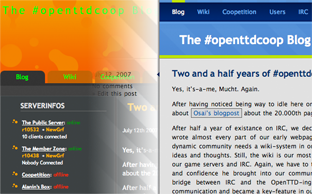
Orange goes blue
Once again, another blogpost by Mucht!
Dr. Osai has done a lot of coding work in the background in order to improve our blog even more!
The current, orange-bubble-lava-grey design has been up for almost a year by now. Both wiki and webIRC were well integrated into this design so you may assume that changing to another design is a task requiring some work and time – but: Osai made it!

Besides some eye-related improvements, the new design is expected to load some 3times faster than the old one did, bringing information faster to the audience in a visually more advanced way. But everyone judge by himself…
Thx again to Osai!
I like the new style, It is cool and functional.
Thanks!
I like it a lot, too. The only thing that bothers me is the left sidebar (the one with stripes) – it’s a waste of precious space!
I agree with muszek, I don’t like the left sidebar. And in all honestly I preferred the orange design, although not to say that the blue one isn’t of excellent quality.
The RSS Feeds, Shortcuts and Servers I feel should be on the left – normally the most important content is located on the top left, and the sidebar contains what I consider to be the _least_ important content sadly.
I preferred the orange. )-: